Being a character designer for an indie Visual Novel
Hey champs, we're back with another survey. Sorry, we haven't gotten a new build up yet, but our team is very busy at the moment. Please be patient.
Anyways, new survey. This survey asks questions about what direction the art should head towards in the future. In short, it asks how exaggerated the sprites should be, what CGs should focus on first, if the MC should get a real character design and most importantly if certain characters should be redesigned. You can fill it out here. When you're done with the survey, please come back here, or else all this text I typed out below will be wasted like so much cheap gin.
EDIT: I have written a response based on the survey results. You can read it over here.
Done with the survey? Okay, let's continue.
I officially joined the team on September 12th. The game was for Bara Jam 2021, and I joined as both the character designer and the sprite artist. I didn't know it at the time, but I had a lot of work ahead of me. I was told to design each of the datable dwarves. I was given a short description of their characters and a Hero Forge model for each of them.
Why are you considering redesigning some characters? Do you dislike the character designs of those characters?
So before anything else, I want to make it clear that I like all of the current characters. I think they're rememberable and I think they indicate each of their characters well. However, I want to make it clear why I'm considering changing them. When I first designed the characters, I didn't know much about the rest of the team. The one I knew the most was Gryph, and even then I didn't know too much about them. Because of this, while I was designing these characters, I asked a buttload of questions to them. What setting is this game? Is it medieval fantasy? How do dwarves work in this universe? How do you want me to render the sprites? The team did a good job answering most of these questions, however, there were a few to which they gave broad answers to me. For example, I asked what style they wanted from the game and they basically answered "Anything is fine" which wasn't really helpful. So for a few months, I wasn't sure what type of game Dwarven Destiny was supposed to be. That affected how I designed the characters. You see, when you design the characters for your own project, it's rather easy. Like when I designed Hardy from All in Love and War, I had a clear vision of what he should look like. He had a direct but friendly personality, he was close to retirement and has a lot of baggage, the game had a semi-80s anime art style, and I knew what a sexy, bearish old man would look like in that style because I'm interested in that type of men and I find comics and art with that type of men easily, so I have a reference for that kind of man. For Dwarven Destiny, however, I had to constantly ask the other members of the team for references to get a closer idea of what they should look like. I still wasn't 100% sure if that's what they should look like because they weren't my characters. I didn't know what was best for them.
I also only had basically a month to design all of the dwarves. Since it was a game jam game, I had two months to do the sprites. Because of that, I wasn't thinking too much about character design. Now when I came up with the first character designs, the team loved them. While I made a few adjustments to them over time, the overall designs stayed the same. However, I told them that the character designs could change in the future to better reflect their character. I made sure to highlight how important it is that their character designs reflected their personality, backstory, and everything. But for the most part, everyone, including me, was content with the designs as they fit the characters and looked appealing. To be honest, I was really busy with All in Love and War and college at the time, so I didn't have much time to be worried about the Dwarves' character designs.
When we released our survey about NSFW preferences back on the 4th of June, however, Oliver asked me what lewd scenes I wanted to see in DD. My answer was… detailed, but it involved Oghram, Horgath, and Panya. Oliver then joked about how obvious my preferences were. I then said I just found those three the hottest. I liked everyone in DD, those three were just the ones I found the most sexually attractive. He then asked me, and this is the important part, what I'd do to make the characters attractive. At first, I didn't really care, but then I thought about it more. I then sketched some new designs I found attractive for them and shared them with the rest of the team, and they loved them. And that's how we're here. I want to go into each character's design, evaluate them, and see how they'd change in the future.
Oghram Early Descriptions of him: "Guardsman - Arrogant / Proud. You greet him, and decide to bring him a plate of food from the Inn?"
Hero Forge Design
Current Design
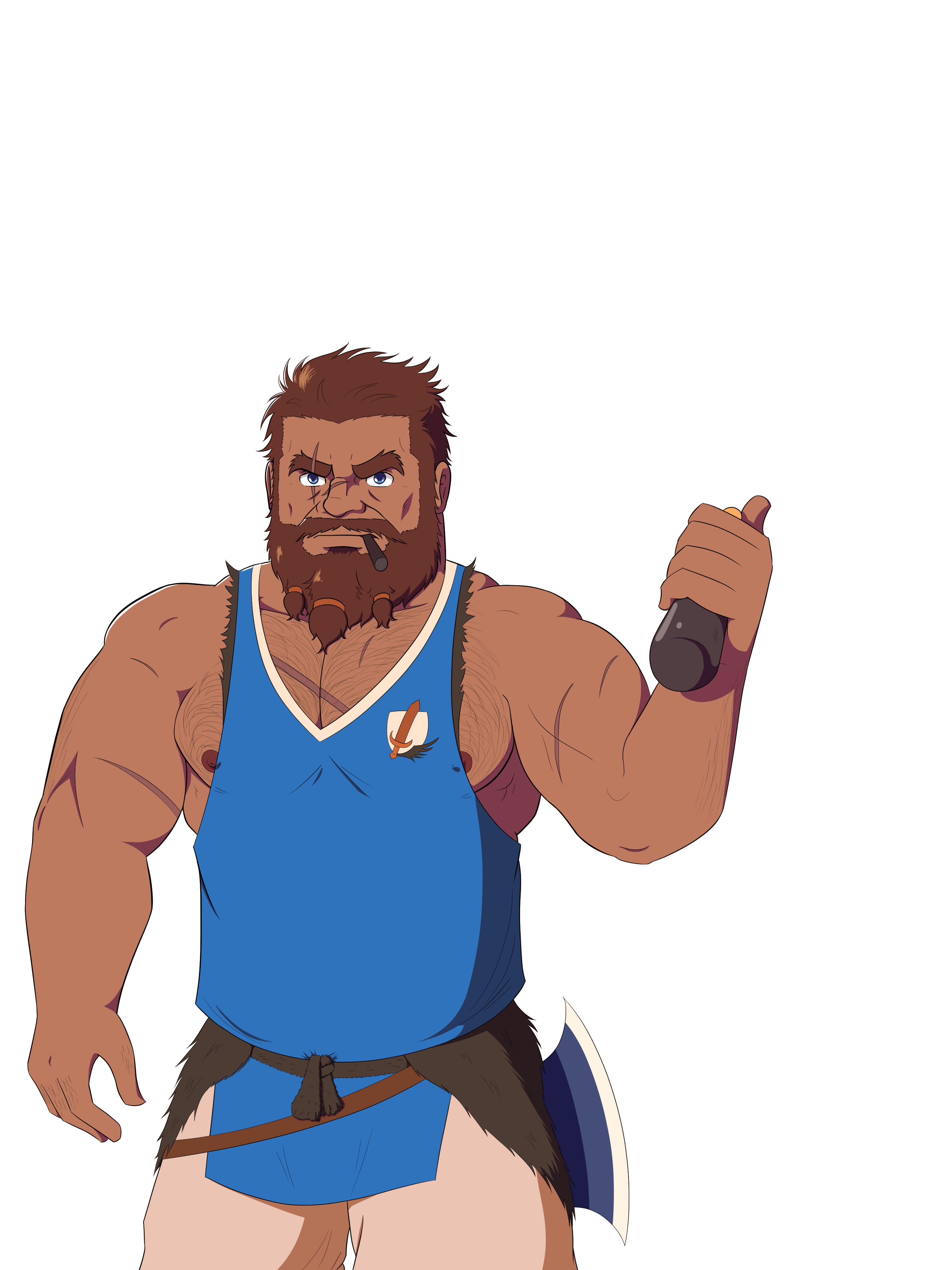
This design is simultaneously both faithful to his HeroForge model and also really divergent from the model.
For whatever reason, I had an easy time imagining this character. Gruff, guardsman, and prideful. I think of characters like Manly Dan from Gravity Falls and I'm like, "Yup, I know exactly this type of character." One thing I didn't expect from this character was how bashful he ended up acting towards the MC. I kinda expected that he would act more stoic and professional when talking to the MC during the first day, but it's nice to see he has a vulnerable side. The thing I like the most about his design is how his casual clothes contrast with his guardsman armor. The difference between rough and tough to formal and uptight is really nice. I do question if it was the right choice to make him so fit. I mean I haven't seen a lot of dwarves who doesn't have a belly. But at the same time, dwarves aren't real, and I do want some variety in character designs, so I figured it's fine that he's lacking heft. Probably my biggest regret was that I didn't make him look gruff enough. I didn't even realize that fully until I commissioned the wonderful Renzo to draw a headshot and it makes a big difference.
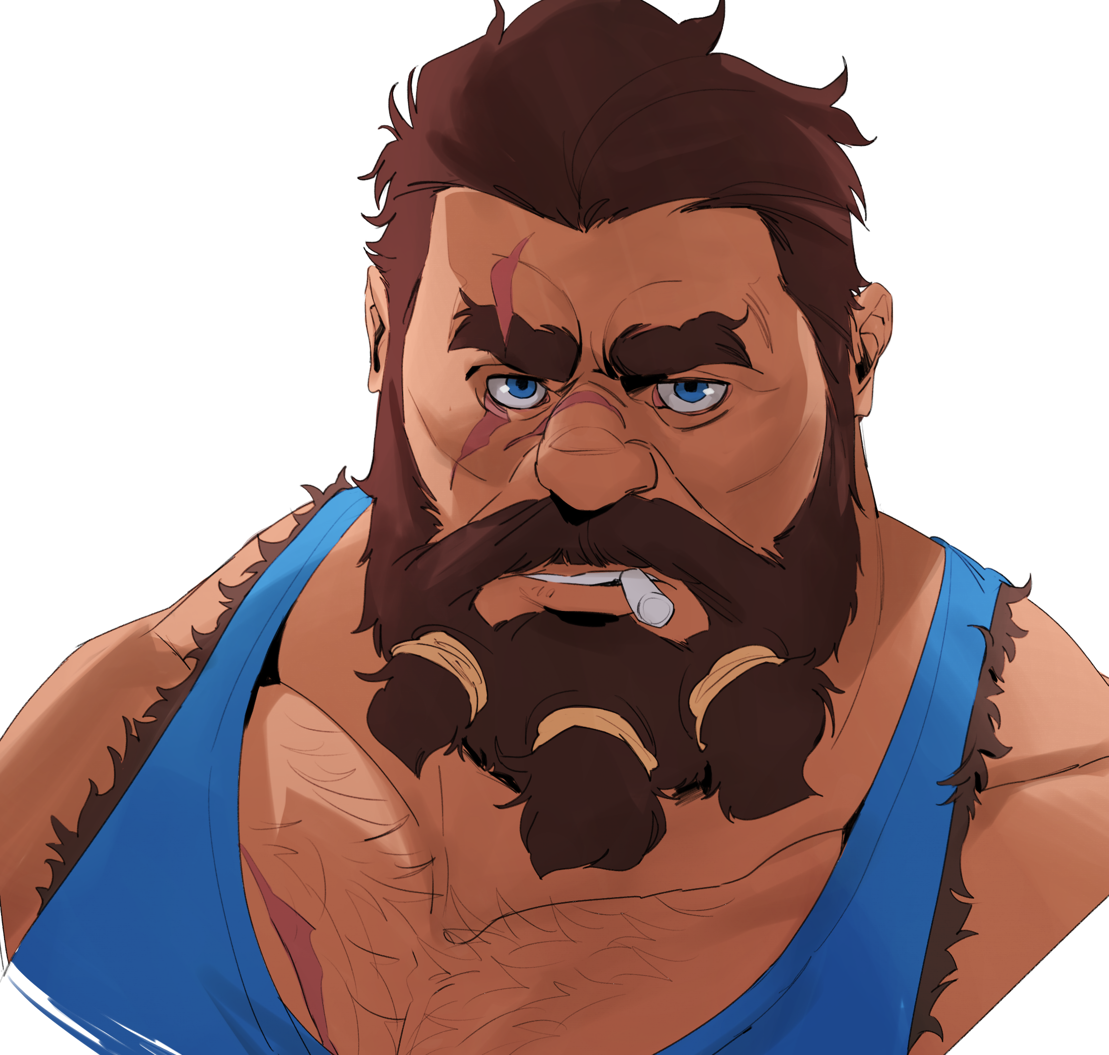
If or when I redo Oghram's sprites, the only big change I'll make, aside from improving the general quality, is to make him look gruffer. I love the gruff.
Horgath
Early Descriptions: "Gruff and Cranky. Location: Forge. Quest: Knife chips so you have to head to the Forge to get it remade."
"Cranky and gruff he has a stern look on his face almost indefinitely, it is very rare to see him crack a smile despite his appearance though he is actually quite nice which can be shown through his general body language. He is on the average side of dwarf heights but isn't as broad-shouldered causing him to look slightly taller. Also quite stocky but is more built with muscle from the constant work he puts in at his forge. Outside of work he wears more casual clothes a long sleeve blue shirt with grey pants. In work, he wears a blacksmith's apron over his clothing which has a variety of tools including a hammer he keeps on his side. He closely resembles the Baker [Panya] in general physique but is much more burly and muscular."
Hero Forge Model
Current Design
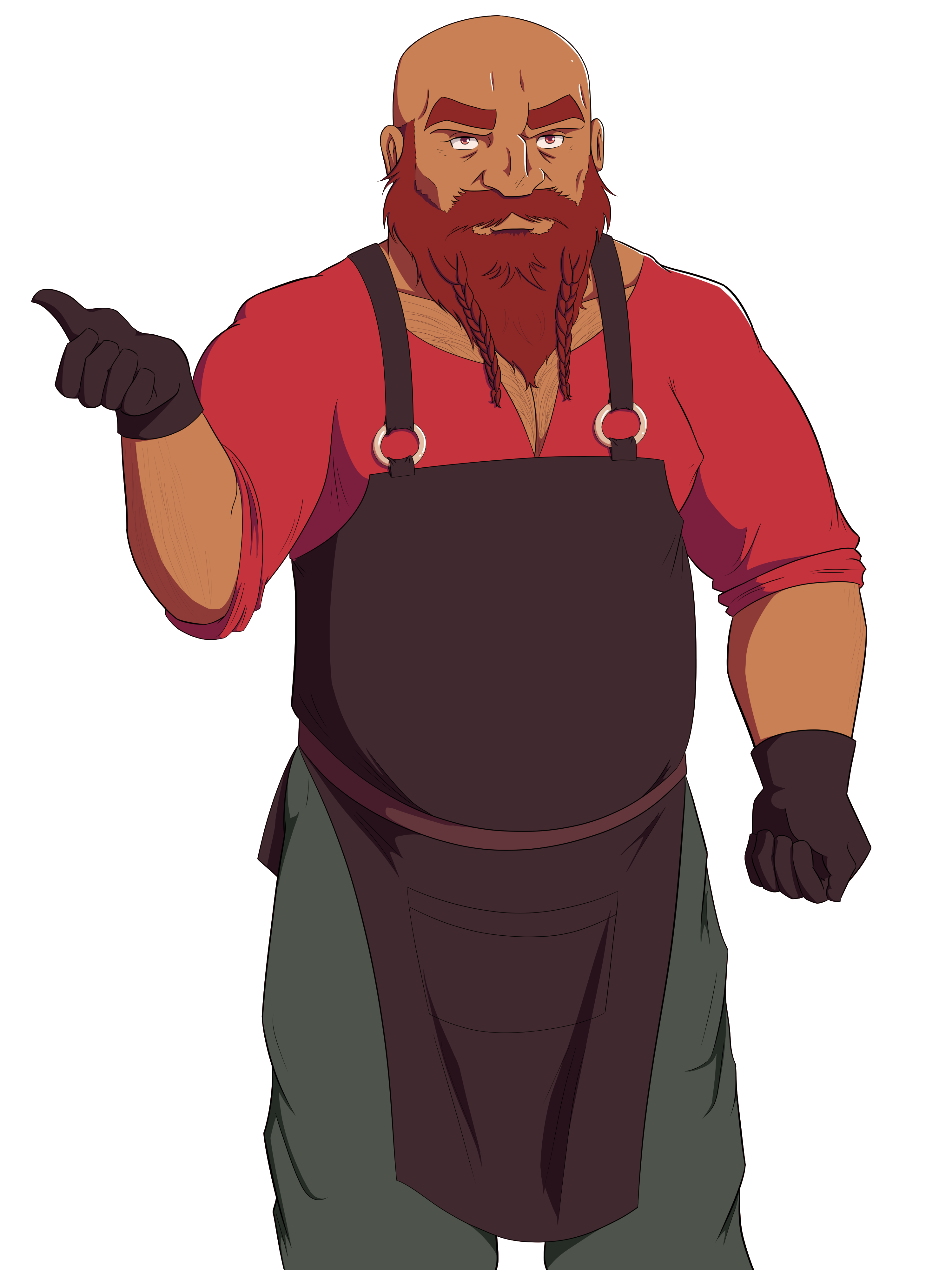
Yeah, I took almost nothing from his model, lmao. Like with Oghram, I just kinda knew what to draw when I read his descriptions. I saw that he was a blacksmith, and I thought Vulcan from SMITE. I saw that he's friendly despite rarely smiling and I thought of Benny from Fire Emblem. That's how I created Horgath's sprites. I will say that I drew Horgath's sprites weirdly. I drew his legs too long (either that or he has no idea on how to wear pants) and I'm not completely satisfied with how I drew the face. I specifically asked Gryph to lower Horgath's body so you don't see his legs too well. I like Horgath's design because it's gruff, without being so in your face about it. I think it fits his character, and I really like his character, I think he's funny. But yes, the first thing that will change when his sprites get some refinement is that his legs will be much shorter.
Panya
Early Descriptions: " Baker (Upbeat, passionate) - loves to cook and will feed you given half a chance. You decide to talk to the cook who's cooking delicious food at the Inn, and compliment him. (Or you track down a missing shipment of food, and return it to the Inn?)
Hero Forge Model
Current Design
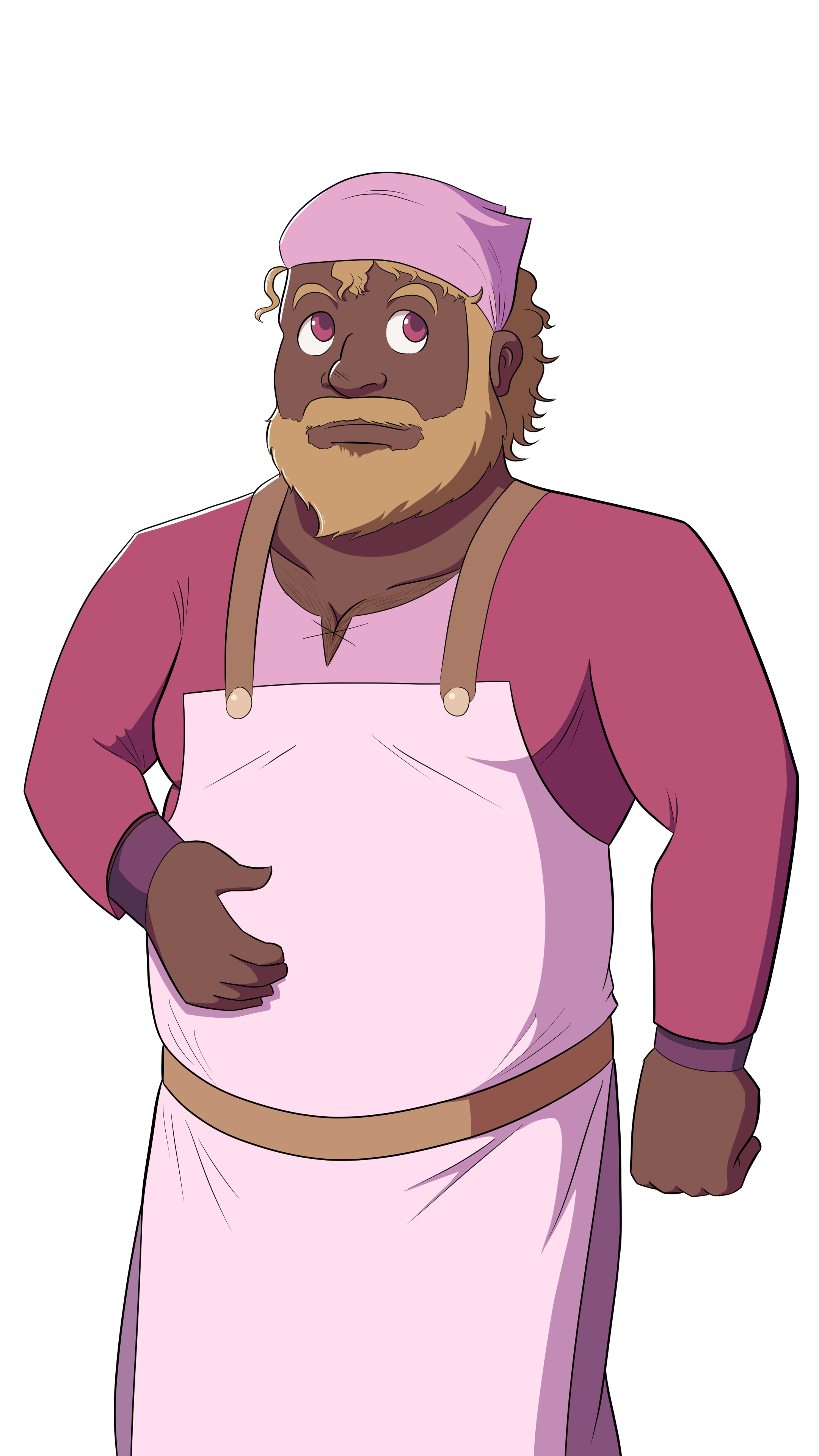
I don't have much to say about Panya other than I assumed he was jolly and on the chubby side because he was a baker. Maybe that's stereotyping, but it made sense to me. Oliver also specifically asked me to make him chubby and to give him curly hair, things he couldn't give to his hero forge model. And I'll be honest, I really like Panya's character design. He has that nice mix of cute and sexy that I'm not able to get too often. Like I see bara character designs that are so cute that I want to die from just glancing at them, but Panya is just cute enough while still having sex appeal. As for sprite refinements, I'd like to fix the foreshortening of his right arm. I didn't even notice I did it wrong until one of Oliver's artist friends redrew him and fixed the foreshortening and I was like "Fuck!". Oliver also wants me to add a little more heft to him, so when it comes time to refine all of the character's sprites, he'll receive more chonk. And he told me to add a lot more body hair, so I hope you don't mind a little fluff here and there.
Also, side note about the Innkeeper. Originally she was a man, but I convinced Gryph to make her into a woman because she's the first character the player meets, and having the first male character you meet in a gay dating sim to have no route would be confusing, to say the least. Even if a male Innkeeper wasn't the first character you see, people would still ask for a route of him and we just weren't interested in such a thing. When the Innkeeper became a woman, Oliver suggested she would be Panya's mom, and that's how we got the Innkeeper we have now.
Now onto the characters I and the other members of our team are thinking of changing.
Arondal
Early Character Descriptions: "Merchant (Cheerful, helps you with clothing issues/impressing other Dwarves or him) you have to buy some supplies for the researcher"
"A cheerful and relaxed dwarf on the shorter side even for a dwarf, he is stocky and broad-shouldered despite his small stature. His clothing consists of a pair of grey pants that seem a little too long for him and a dark blue shirt that has been tailored to fit him quite snugly over the shirt he wears a light yellow vest that has a sun pattern strewn about it, his shorts look more like slippers as they are made from animal hide and have fur on them. His hair is black and slicked back slightly but not too visible due to a flat hat he wears that has a bright red feather on it. He also has a shorter beard that only covers his face slightly since it seems well-trimmed. He looks closest to Orgham in general stature but is shorter a tad bigger in stocky build."
HeroForge Model
Current Design
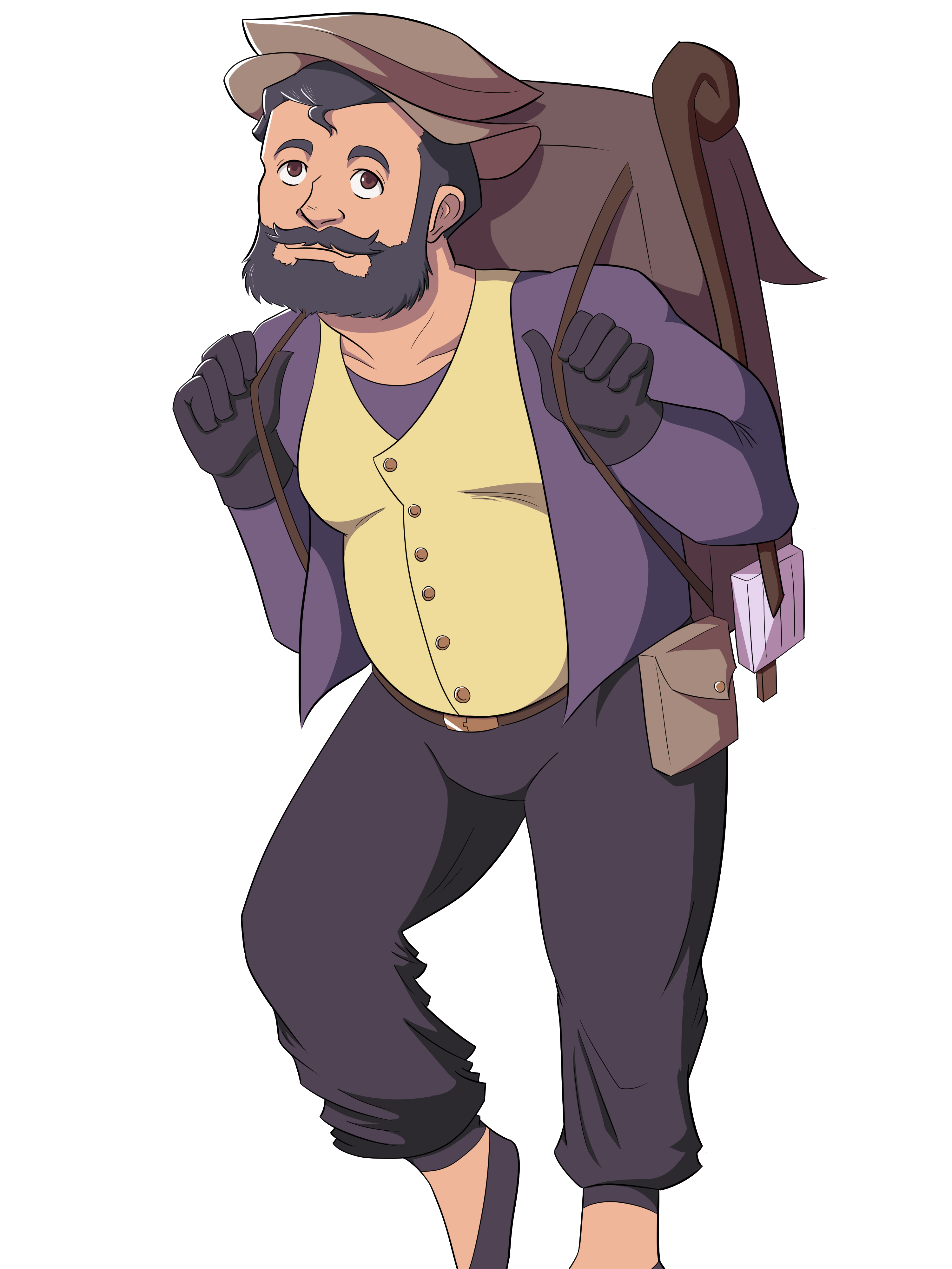
Like with Horgath, I didn't really follow his Hero Forge model that closely (Not a coincidence, since both designs were being worked on before Starfur created the Hero Forge models for them). There's nothing really wrong with this character design. It fits his character, as this eccentric merchant who's a little teasing. That part's fine. The problem is that his character design is just too boring. His hair is boring, his eye color is boring, his face is kind of generic, and his clothes just kind of blend in. It doesn't help that he's introduced alongside Panya, who looks a lot more appealing and interesting than Arondal. That's kind of unfortunate considering he's supposed to look fun and wild, which is why I gave him those silly expressions. He also doesn't look very dwarf-y.
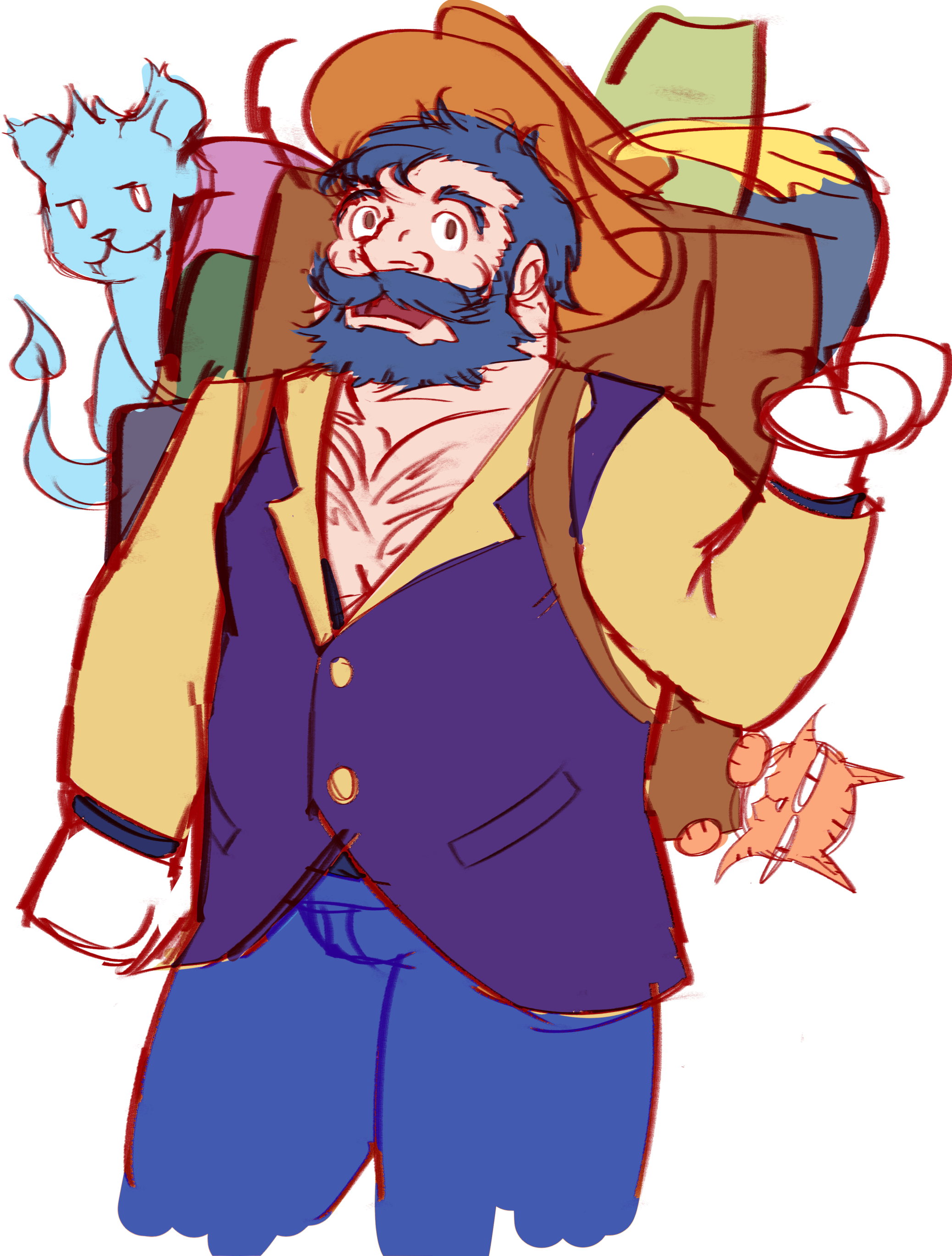
With this new character design, I'm exaggerating his facial hair, his hair, nose, and outfit to look more stand outish. I also gave him a little chest window because right now, he and Kellan reveal the least amount of skin, and that's like no fun in a dating sim. I also initially gave him a gold suit for his redesign but I talked with the team and this is the coloration they wanted. Hopefully, this will make him a lot more attractive to you guys.
Kellan
Early Description: "Mercurial Moods, Prizes Intelligence."
Hero Forge Model
Current Design
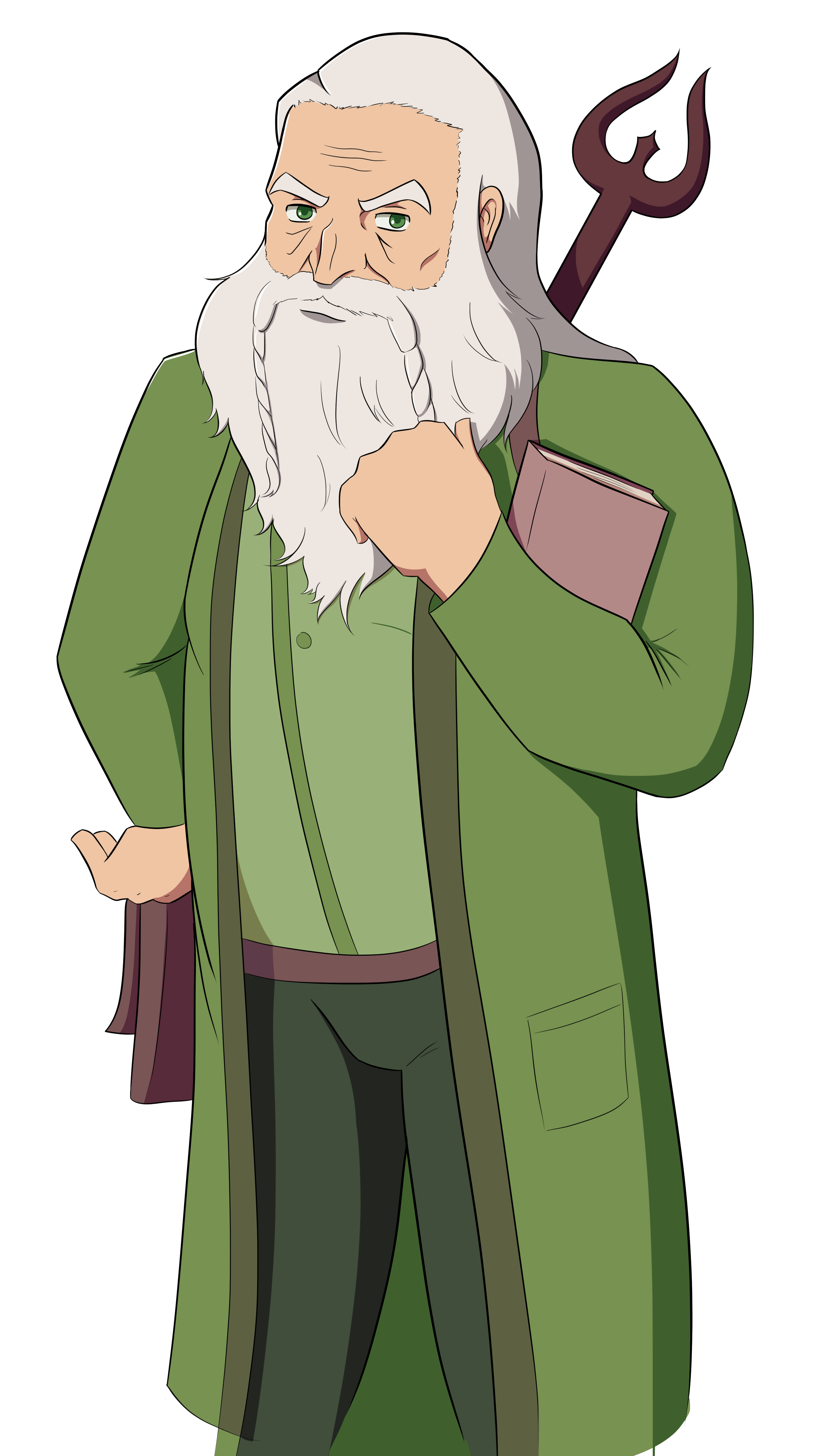
In terms of build, face, and hair, this is probably the closest to their Hero Forge model, and I kind of regret it. It was really hard for me to understand what kind of character he was early on. At first, I thought he was like this peaceful, wise old man. Then I read some of the early scripts and I thought he was a strict person with a sharp tongue. When I read the final script, I realize he's this conflicted figure who wants to be in love but also finds it hard to face those feelings head-on. I think Kellan's current design doesn't say anything about him other than that he's old and an intellectual. Kellan also has the same problem as Arondal in that he looks too boring and his outfit shows too little skin. And what's with that stick behind him? That's not a staff, that's a fancy-looking wooden fork.
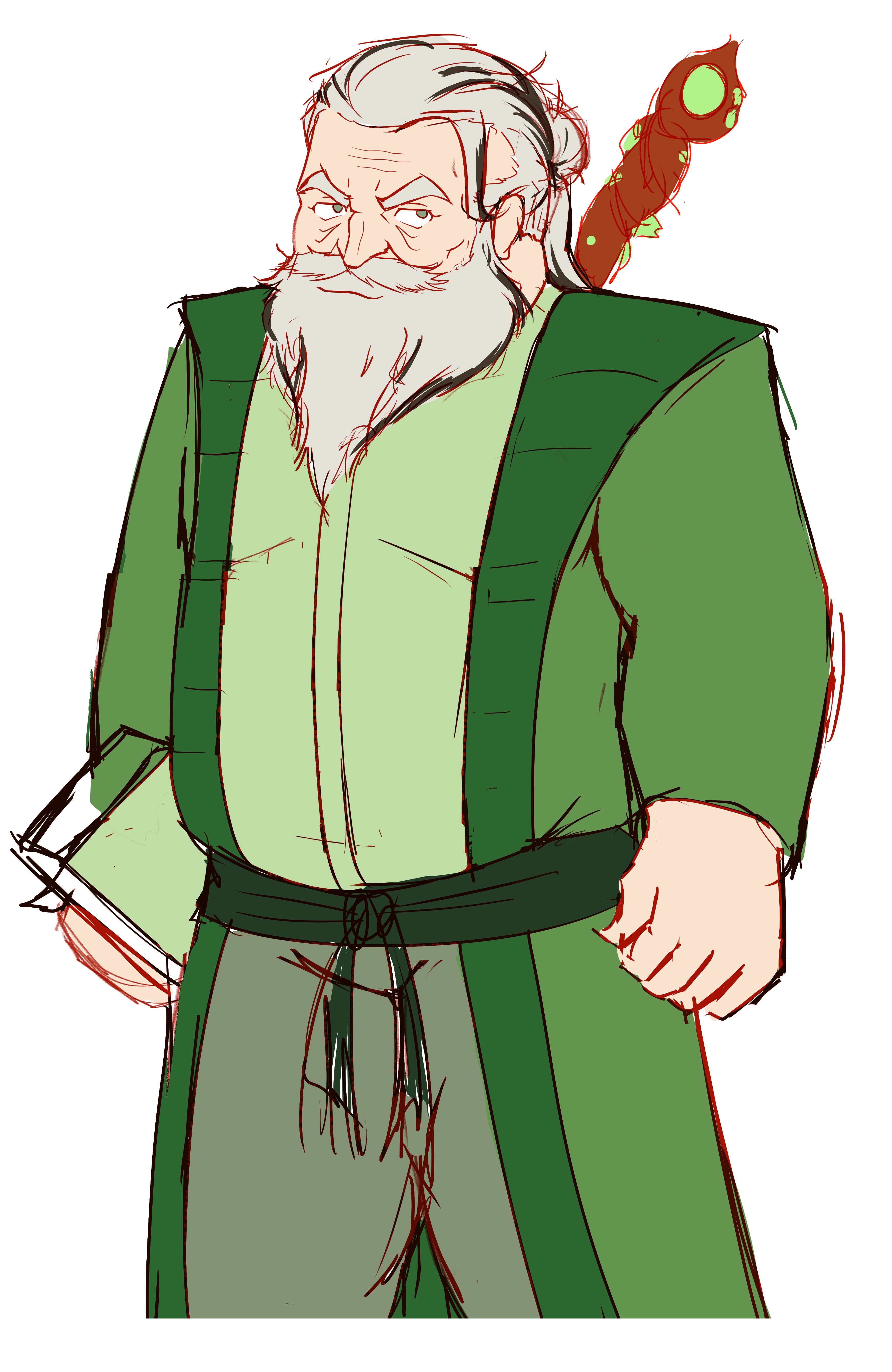
With this redesign, I want to emphasize his age and experience more. I don't know why, but 2D men look sexier the more wrinkles they have on their faces. I also made his long hair into a man bun because I think it makes more sense for him. His belly is now more pronounced to give him a little bit of that dad bod look (Which I don't usually like saying, but I think it fits him). His staff now looks more soulslike (I think?) and natural. The black in his air was a little rushed. If we use this redesign I'll make sure to make the black strands make more sense and also look more appealing. I made his clothes more obviously from a mage/intellectual background. I'm trying to get that lost old soul look done across with this redesign. I hope you guys like the new design.
Lurik
Early Description: "Bandit/Prisoner (Cynical, Suspicious) Guard has to take a break and youre the only one around so he asks you to watch him. you get to talking."
Hero Forge Model
Current Design
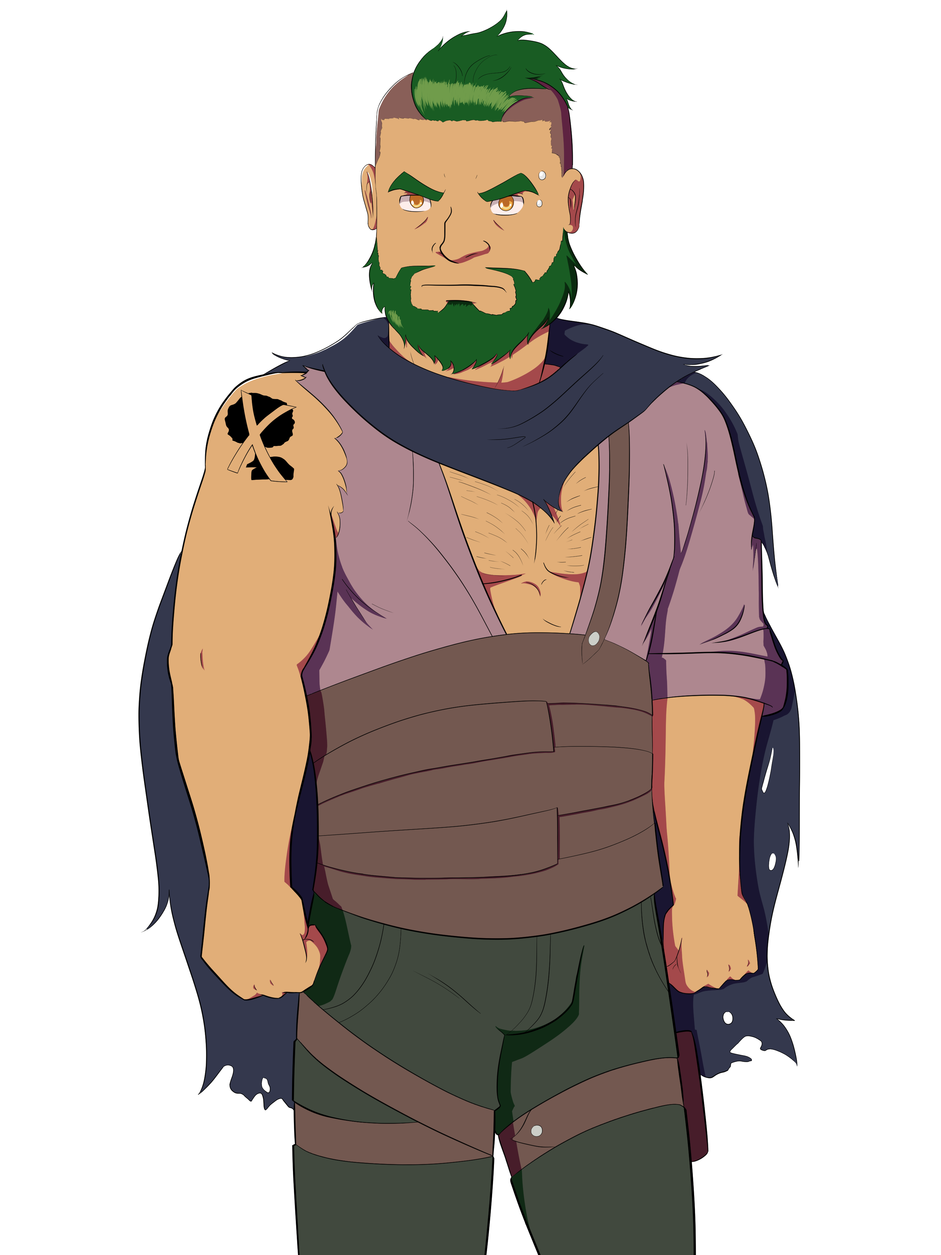
By far the character I understood the least when designing. When I was drawing him, I thought he was like this asocial Tsundere loner who would be hard to talk to. Basically the "I don't need friends, they disappoint me" lady (Funnily enough, this isn't a terrible description for Kellan). So I was quite shocked to see that he turned out to be an edgy, sarcastic bloke with a large mouth. I also made him quite skinny for a dwarf because I read that he was a thief and thought that made sense at the time. However, I realized that he was too skinny to be a dwarf. Because of that, he stood out amongst the other dwarves, and not necessarily in a good way. I think I wanted him to be skinny because I wanted diversity in the cast. I thought, "I can't have every guy be a beef muffin, I got to put in some skinny legends in there." Then I realized I can have every character be a beef muffin because people who play this game wouldn't complain about that. Looking back, it felt like I was forcing myself to draw a skinny character when I wasn't really interested in drawing such a body. And like, if you're an indie game artist and you aren't drawing what you want to draw, what are you doing?
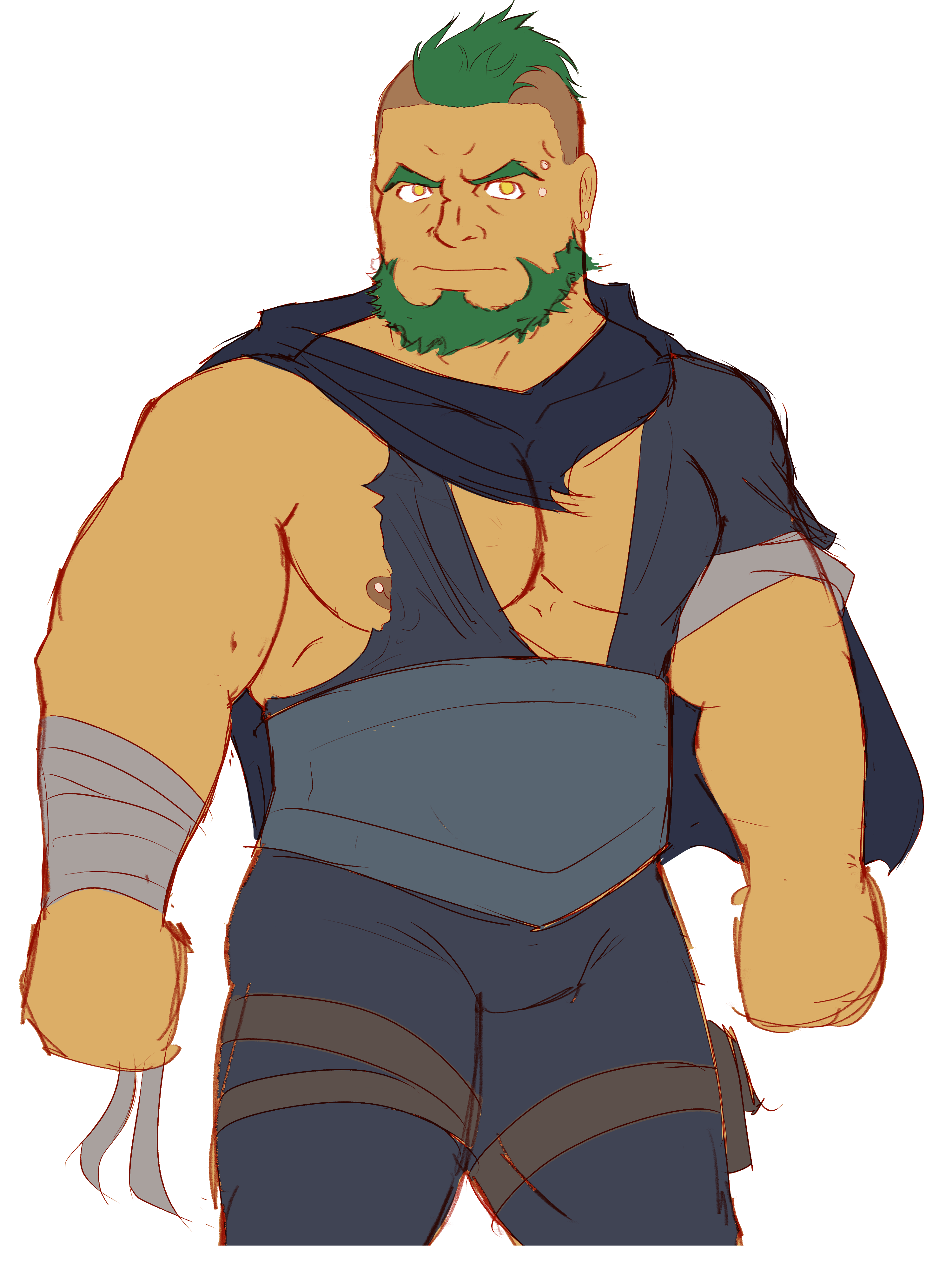
So yeah, with this redesign I'm saying, "screw that, time to pack on the beef." I showed this to Oliver and he told me that it looks like he's wearing a jumpsuit. I don't mind, but if you guys don't like it, just tell me. He also told me that I show let him show some nip, and so I did. I also forgot to draw his tattoo, which it's supposed to be there. This redesign is going to be a bit jarring for some of you, but hopefully, you guys will get used to it if it becomes the new design.
Overall, I think the main issue I had was that they didn't look dwarf-y enough. Either they had body types that were way too average to be a dwarf body type or their proportions looked too human for them to be dwarves. I'll amend these as I redo the sprites. But the main reason I'm showing you these new designs was because I found them a lot more fun to draw than the old designs. I'll be frank with you, I'm mostly interested in either chonky guys or beefy guys. Skinny, lean, and average bodies don't do it for me. So having these new designs that are fun to draw with bodies that I"m into really helps me in my role as a character artist. I want your main takeaway from this, if you're an artist, is that how fun a character is to draw is just as important as how appealing they look. You're going to be drawing them a good amount, so it's better if you enjoy drawing them. This sounds obvious, but a lot of the time, artists are more interested in having character designs that look cool, as if they came straight out of a modern Final Fantasy game. So they'll make their characters wear ridiculous outfits because they think it's appealing. But it's not like they want to draw all that shit, so they just won't draw them as much. Or in the opposite end where they make a character design that's functional and serves its purpose for the project that it's in, but they're just too plain for them. They won't draw them unless they have to because they're just too boring. So if you're an artist, aim for a character design that's both appealing and fun to draw and you'll get the best results.
Some things to note about redesigns and sprite refinements:
- Each character design will take time. That means future builds of Dwarven Destiny will be delayed, or I have to take time away from my current project, Barachoda Bloom. I want you guys to understand this when deciding if I should redesign some dwarves or not.
- All dwarves will get some sprite refinements at some point, even if they don't get major redesigns. This will mostly fix art errors and make the lineart look cleaner. However characters that won't get major redesigns aren't top priority in terms of sprite refreshment, so they will take time to get fresher art.
- The dwarves that do get redesigns will have their old sprites ready for download somewhere. We want you to be able to mod the old sprites back into future builds anytime you want to. Please note that CGs and outfits will be made with the new designs exclusively, so if you do mod the old sprites back in, they may clash at points.\
Finally body proportions. Some people really like the exaggerated bara proportions like what Kokukokuboo or Spedumon draws, but I'm personally someone who likes just a little exaggeration. That being said, I try to make sure everything has realistic-ish proportions. Still, I'd like to know what your thoughts are.
Am I forgetting something? Oh, that's right. The protagonist. We didn't really talk about the protagonist that much because we didn't need to since you never see what he looks like and the attention is put on the dwarves. But I couldn't help but be bothered by how sex scenes will work if we don't know what the protagonist looks like. Is it going to be like HuniePop where you just see the dwarves react to you and you never see the protagonist? Are we just going to be translucent hands, dicks, and holes that appear in sex scenes? Or maybe when the protagonist finally has sex with one of the dwarves, we finally get to see them after hours of being in the void. That's what I wanted to address in the survey. I came up with the character design for the MC several months ago, but I'm interested in seeing if you guys even want a character design for him. A lot of people really like to self-insert themselves into the protagonist's shoes for obvious reasons, so a character design will make it harder for them. Ideally, we'd like to make it an option for the protagonist to be a translucent void, but we want to hear what you have to say about it. As for the design itself, I thought about making him muscular, but Oliver objected to that saying that he wanted the dwarves to stand out against the protagonist. Other than that, I tried to make him as relatable to the audience (you guys) as possible. He is his own character, but it would be a missed opportunity if we didn't make him a good enough stand-in for the player. We're really curious about what you guys have to say.
I think the most important thing to gather from this is that it's never too late to change stuff, but the later in development you do change stuff, the harder it will be. Try to plan as much at the beginning. It will make things a lot easier later on. And do what you love. That makes everything less painful.
EDIT: I have written about the results of the survey. You can read it over here.
Anyways, hope you guys stayed with me for this entire DevLog. Thanks for reading and be patient for the next update of Dwarven Destiny. It will take a while. And I'm also working on my own project Barachoda Bloom, which you can read about over here. If you want to hear more updates about it, please follow me on itch.io and on Twitter. And follow Gryph to hear more updates about this game as well! See you later, and have a nice day.
Get Dwarven Destiny
Dwarven Destiny
A dating sim for those who love them short and sweet!
| Status | In development |
| Authors | Gryphbear, ChellayTiger, StarFur Industries, Oliver |
| Genre | Visual Novel, Interactive Fiction |
| Tags | Bara, dwarf, Fantasy, Feel Good, Gay, LGBT, Male protagonist, Romance, Story Rich |
| Languages | English |
More posts
- Build 0.5.0 now available and an announcementMay 04, 2024
- When's the next update coming?Nov 03, 2022
- NSFW Survey ResultsJul 30, 2022
- Artistic Curiousity Survey ResultsJul 05, 2022
- We're alive and have NSFW questions~Jun 04, 2022
- Kellan and Horgath's Initial Day UpdateMay 11, 2022
- Progress Update (So far)Feb 16, 2022
- Dwarven Destiny 0.2 Update!Jan 10, 2022
- Dwarven Destiny Update NewsJan 01, 2022
Comments
Log in with itch.io to leave a comment.
This was a super interesting read, I never thought about the difficulties of designing characters for other people. The new designs are absolute fire, especially Arondal's.